We have certain expectations when signing up for an account online. We expect it to be seamless, we expect it to be frictionless, and we expect to never worry about remembering a password. eBay has begun to meet these expectations, which has given me the opportunity to completely redesign the registration experience with social sign up.
Design Space
Users want to register without having to create a new account and remember another password. The problem is that eBay is gated. That means that when users want to buy or sell something, amongst other tasks, they have to enter personal information, which causes friction and, therefore, drop off. Though eBay is not currently in a place where they can remove the gate, it can definitely be made simpler and more familiar in order to meet marketplace standards.
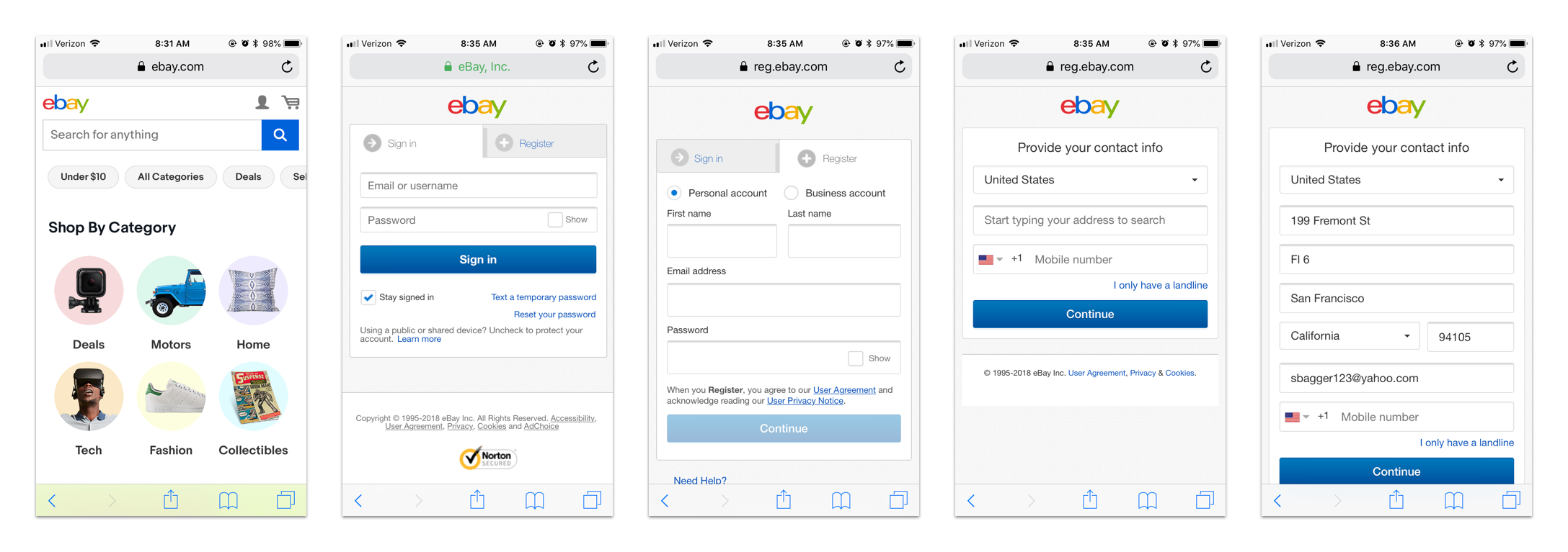
Current registration on mobile web
The MVP
My goal for integrating social registration was to make each gated flow feel lighter, getting more users through account creation more efficiently. The outcome focused on minimizing cognitive load without compromising transparency.
The Ideal New Buyer Experience
Step 1: A user opens the eBay app to find an item they want. They immediately search for the item, find it, and decide to buy it.
Step 2: When the user taps the “Buy it now” button, the sign in portal loads. The user can connect with social entry here, but the “Create an account” button seems more intuitive and taps it.
Step 3: At this point, the user is explicitly in the account creation context. The user makes a quick decision to continue with Facebook, over entering an email.
Step 4: After going through Facebook permissions, the user lands on the social registration page. The user can review their personal details collected from Facebook, as well as the eBay legalese, then tap “Create your account” to complete the process!
Step 5: Once the account is created, the user can sign back into their account by selecting the Facebook button, streamlining future interactions.
Platforms Nuances
This project spanned the desktop, mobile web, Android, and iOS platforms. Each experience was tweaked to meet the nuances of and patterns for the specific platform, taking into account major user groups and use cases.
Android
iOS
On both native platforms, users who decide to explicitly register from the homepage will experience a registration portal page, helping to reduce cognitive load and convert users. On Android, Google authentication is prioritized anywhere social entry is surfaced.
Mobile Web
For mobile web, users will also encounter the sign in portal page. If an existing user selects Facebook, but uses a different email from eBay, they will land on the Facebook registration page with an option to link to their eBay account.
On both native platforms, users who decide to register with their email experience a task focused form experience. For iOS, Facebook authentication is prioritized anywhere social entry is surfaced.
Desktop
On desktop, social entry is on the registration form page. A columned layout was designed to create greater distinction between the email and social pathways. On all platforms, the password component uses dynamic helper text to inform the user of the remaining requirements.
The Outcome
While eBay may now be on a slightly newer version of this experience, the social integration project had huge impacts on the user journey and eBay’s bottom line. The data below comes from eBay’s test in 2 countries, Australia and the UK, over 5 months.
- Between 30-40% increase in registration conversion on the eBay Native app
- 40% of all accounts created on mobile web are now through Facebook
- 25% of users who sign-up with Facebook make a purchase the same day
- In the last month alone of the Australian test, there was a 5% increase of active buyers
The test went so well that eBay rolled out the experience to all markets, meaning the entire world.
Process
With the goal of increasing eBay’s active buyers, the product organization prioritized the implementation of social integration for sign up and sign in to decrease friction for new and returning users, by removing the need to remember a password.
Frame
Competitive Analysis. At the start of this project, I created dozens of accounts and collected over a hundred account creation pages for different sites and services, because it was important to re-contextualize myself with the various solutions that exist in the marketplace.
Alignment Flows. In order to get all parties on the same page and scope the project, myself and the sign in designer defined the main use cases and created flows with rough draft concepts. This exercise not only jump started the conversation, but pointed out areas of focus for several teams who were about to start working on it.
Abstract Alignment Flows
Wireframe Alignment Flows
Constrain
Defining the MVP. The MVP was carved out from the alignment flows. With the designers, myself included, our project management and development counterparts, we discussed a smart, personalized experience where social sign up and sign in could thrive within the business. We agreed on using our new branding guidelines, having new users only use Facebook or Google throughout their lifetime on eBay, and linking existing users, all without changing the infrastructure of the site.
Registration page touchpoints
Starting with Native Registration. Our native development team was ready to start build first, but they were using webviews for the account creation process. As a prerequisite for social integration, they needed a brand new registration design that would easily scale to include the social aspect.
Explore
Native Registration Workshop. In order to start defining a cross platform strategy for sign up and sign in, and to understand what was possible on native, I held a day long cross-discipline workshop. The workshop started by building context about the opportunity space, moved through competitive analysis, understanding our users, and exploring concepts, all the way to defining an ideal experience. I knew that social was only the first step in bringing down our barriers to creating a more intuitive and personalized experience and a workshop would help define what was possible.
Reframing Terminology. One of the big changes made for this project was language. I explored frameworks, expressing various tones and moods, and referenced the marketplace to understand how different products used language during account creation. I ended up emulating a direct but friendly tap on the shoulder, from companies like Slack and Google. The page title, from “Register” to “Create an account,” and errors were two of the places with the greatest impact.
Using "Create an account" terminology
Directional errors
Friendly error tone
Native Concepts with Social. With the native strategy set, I moved to exploring how the social entry point could be built in. Integrating a social entry point also included a new social registration page and support for existing users to link their account.
Native App Registration Exploration
Social Registration Page Iteration
Scaling Across All Platforms. Once the Android and iOS experiences were essentially complete, the focus turned to designing for the mobile web and desktop. The web platform has dramatically different users within eBay, like businesses that need to be able to create an account, as well as additional organization components impacting the visual aesthetic of the experience, like the logo or a navigational footer.
Mobile Web Registration Exploration
Desktop Registration Exploration
Focus
Stakeholder feedback. The concepts were presented to our initiative and product owners, who favored the idea of a centralized portal screen for all users, which aligned with what design had wanted to do. This decision shifted the experience, leading us to our final UX for Android, iOS, and mobile web platforms.
Outcome of Stakeholder Feedback on Android
Outcome of Stakeholder Feedback on iOS
Outcome of Stakeholder Feedback on Mobile Web
For our MVP rollout, stakeholders saw value in the two column layout for desktop. While not the ideal, which would have kept eBay’s products in view with a modal or a Pinterest-style background, the two column layout used the space well and created a clear distinction between the pathways.
Outcome of Stakeholder Feedback on Desktop
Define
Interactions. With final designs going for specs and developer reviews scoping designs output, it was time to lock down how users would experience the transition and responsive points of the account creation process.
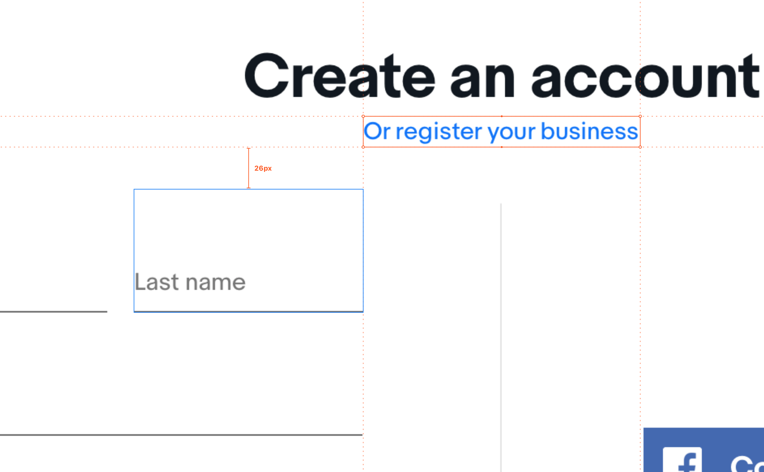
Specs. Using Zeplin, the development team was able to have an open discussion with me about how things would actually look, feel, and work.
Planned impact. This project was seen as one of five major initiatives for eBay’s 2018 active buyer goals. The initiative was forecasted to increase registered buyers by approximately 5.5 million user this year.
Next steps
Social integration is just the beginning. First Facebook and Google, then using phone as an authenticator, then biometric authenticators, cross device sign up with trusted devices, and remembered devices without accounts.


